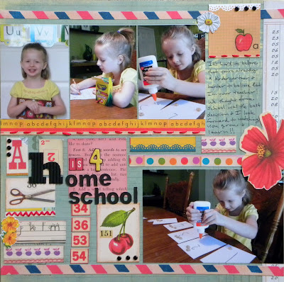
Has definitely been needed this week!! Our rambunctious 2 year old decided to smack his head into the fireplace this past Wednesday and we had to make a trip to the ER to get a total of 13 stitches!! So needless to say, it has been a very stressful week for mommy!! I didn't think I would actually have time to get a lot of scrapping done, but I think I managed to squeeze in about 4 or 5 pages...somehow...this week! :)This first page is for the 9.15 challenge at Sketchy Thursdays. They partnered with ScrapFit this week to do a sketch challenge and a layout on friendship. I used the fun 100 Days of Summer papers from Simple Stories for this one. I didn't really have any "friend" pictures of my own to use for this challenge, so I decided to use these cute pics of my son and middle daughter overlooking the bay. They play really well together and are usually pretty sweet towards one another!! :)Products Used:Paper: Simple StoriesStickers: Simple StoriesBrads: Bazzill & The Paper StudioBaker's Twine: The TwineryThickers: American CraftsInk: MementoPen: ZigFont: RavieThe second layout is actually for three challenges!! I did it for the 1 Hour Challenge from Club CK this past Friday 9/16/11, which was to use scraps on your page. I used some Bella Blvd scraps for the punched border under my photos. I also used this one for a second challenge at Club CK for the Premium Members, which was to add meaning to your layouts using color. (See below for a listing of the colors and the message they convey on your layouts). And last but not least, this layout is based on the Week #1 September sketch from Sassy Lil' Sketches.Red conveys intense emotions. These included anger, passion, power, youth, excitement and danger. Use the color red carefully, and in small amounts, or it will overshadow everything on your page.
Pink suggests various emotions based on its value or strength. Hot pinks are energetic, youthful, and hip. Lighter pinks are sweeter and more delicate.
Orange is dramatic and intense. It's bright, vibrant, and commanding.
Yellow is associated with sunshine, light, warmth, and cheerfulness. Light, cool hues represent babies and springtime. In more intense hues, yellow reminds us of summer and childhood. Warmer yellows remind us of fall.
Brown reminds us of the earth and evokes a natural, safe feeling of hearth, home and security.
Blue is a cool color, strongly associated with the air and water that's essential for our survival. It's usually seen as a serene, calming, and stable color. In darker shades if feels traditional and institutional. In intense, saturated hues it conveys speed and energy.
Green is the color of all that's natural and life-giving. It's restful, soothing, and comforting. Blug-greens are the most calming, while electric yellow-greens burst with excitement and power.
Purple is a rich and royal color, often associated with all that is stately, regal, and tradition. It also conveys an artistic and mysterious feeling. In less saturated hues it is associated with youth and exuberance, and at its most delicate it's a favorite springtime color.
Products Used:
Paper: Pink Paislee & Bella Blvd
Brads: The Paper Studio
Punch: Marvy
Word Sticker: KI Memories
Thickers: American Crafts
Corrugated Alpha: Jillibean Soup
Flowers: Sassafras
Pom Pom Trim: Wrights
Ink: Stampabilities
Font: Coaster
Pen: Sharpie


