I'm back today, with a new layout for my CropStop Guest Designer post. Since I took several photos, on the 4th of July, I'm still in a Patriotic mood and decided to use some of my CropStop goodies with the new Vintage Summer collection from Little Yellow Bicycle and the Limited Edition June Kit from Elle's Studio. Here's a look at what I came up with! I wanted to add some texture to my layout, so I used the Taylor Embossing Folder from the Elegance Collection. I ran the embossing folder through the Sizzix Big Shot for a dry embossed look on the Blue and White striped patterned paper. And since my layout theme was for the 4th of July, I thought it would be fun, to use the Blossom Doily Die from the Fantasia Collection to create a "firework" on my layout. The CraftWorkCards Candi Dots worked perfectly, to add a confetti touch to my layout and I added them to several of the "flower" shapes on my patterned paper.
I hope you have enjoyed my projects so far for the month of July, and I will be back next Thursday with my last Guest Post! I'll be sharing a Patriotic Card, so I hope you'll stop by to see it.
Over the past 7.5 years that I've been scrapbooking, I can say that I have probably only completely trashed 2, maybe 3 layouts. You know the ones I'm talking about...no matter what you do, you just can't get anything on them to cooperate with you. The layout I'm sharing for today's article at Get It Scrapped!, almost joined that small margin of trashed layouts. Our assignment was Welding, and I really love the way the welded title turned out on my page. I also really love the Travel Girl collection from October Afternoon, and I especially love these photos of me with my Grandparents on a vacation trip from way back in late 1970-early 1980ish. But with all of that said, there is just something, that I don't love about this page all together and I still can't even put my finger on it. I asked my fellow Get It Scrapped! Team Members for advice and they encouraged me to use the layout. So even though it still totally and completely irks me, I am here to share it with you today! :)


Supplies: Patterned Paper, Button, Tin Pin, Stickers, TIdbits: October Afternoon; Mask: The Paper Bakery; Spray Mist: Studio Calico; Punches: EK Success & Marvy; Die Cut Machine: Silhouette Cameo; Stamps: Dear Lizzy & Heidi Swapp; Font: Abadi MT Condensed Extra Bold
Today at Get It Scrapped!, the Creative Team is sharing inspiration for using angles on your layouts. Tilting the photos, papers, and embellishments on your layouts, is a great way to add interest to your layout and provide the reader with an eye catching page! I snapped these photos of our daughter reading, because it's been a bumpy battle, and I was happy to see her reading and enjoying it. I added a slight tilt to my photos and embellishments to add a fun design element to my layout. I built my page by beginning with the photos and placing them at the angle I wanted to use. This allowed me to line up all of the other elements on my page, once I had my photos in place. One of the great things about this page design, was that it gave me the opportunity to use a lot of scrap pieces on my layout.Next time you are looking for a page design to get your creative juices flowing, why not try using an Angle design. I think it will definitely help give you a boost of creativity! Make sure you stop by the Get It Scrapped! Blog to see more inspiration from the Creative Team.Beginning Book Worm by Ashley Horton | Supplies: Patterned Paper, Printed Chipboard Shapes, Rub Ons, & Thickers: American Crafts; Tin Pin: October Afternoon; Enamel Dots: My Mind's Eye; Color Shine: Heidi Swapp; Stamp: Hero Arts; Font: Pacifico
Today is Team A's reveal at Let's Get Sketchy, but I decided to play along, even though I'm on Team B. The Team's reveal is using one of my sketches today, and they all did a fab job! Make sure you come over and play along with us, by linking up in the side bar of the Let's Get Sketchy Blog! My sketch was based on this layout, so the photo and embellishment placement is the same. But I wanted to have some fun with the background, and I used my Cameo to cut the Chevron pattern and then backed it with various patterns from October Afternoon's Midway collection to create an ombre effect. Make sure you stop by the Let's Get Sketchy Blog, to see inspiration from the other Team members, using this week's Sketch!
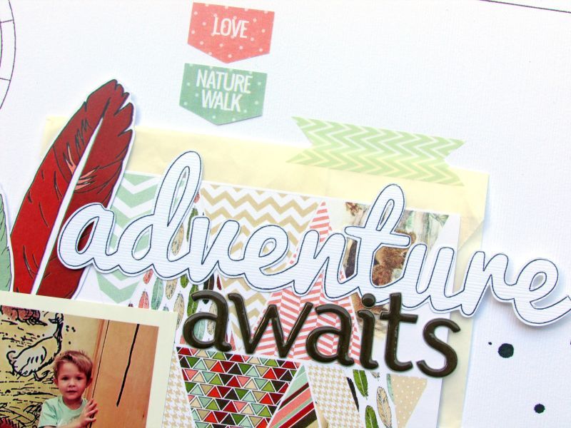
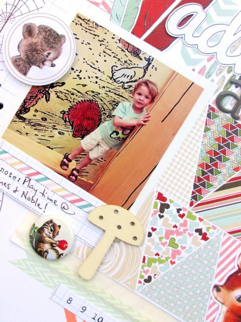
Welcome to the Hop for our newest Issue at Paper Issues, Nature Walk. Today, we are sharing some inspiration using product from Pretty Little Studio! Make sure you stop by the Paper Issues Blog, to enter for your chance to win a Gift Card to the PLS store. I am first up on the Hop, and you'll be visiting several other Blogs to see what the PI Ladies created with the PLS product! Here's a look at what I created!
Here's a list of the other Blogs you'll be visiting on the way.Ashley <------------------- You are here.AudreyBeckiBenteCarolCazPretty Little Studio BlogNext you are off, to visit Audrey's Blog!Thanks for hopping with us today! Don't forget...1. Like Pretty Little Studio on Facebook (tell them Paper Issues sent you)2. Like Paper Issues on Facebook3. Leave a comment on the Paper Issues BlogAnd...did you know, that Paper Issues has a BRAND NEW STORE??!! Make sure you stop by and check it out HERE!
Last Sunday, Chic Tags posted their new Challenge Sunday, to create a layout about YOU! I have to admit this one was a little intimidating, because I (like most of you, I'm sure) would rather be the one taking the pictures, rather than being in them! But, I decided to give it a try, because I loved the inspiration from the DT ladies, and I ended up loving the end result.


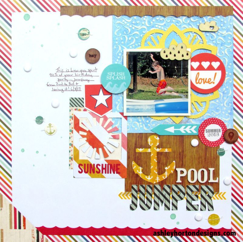
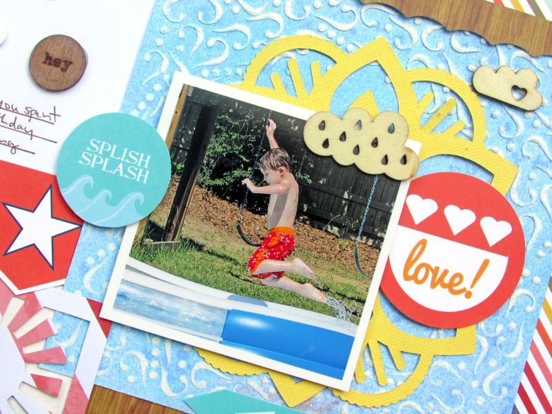
I am back with my second post, as the July Guest Designer for CropStop! I have been in Summer mode, with a lot of my layouts, because the kids have been spending a lot of time in the pool, at the fountain, or outside. And today, I have another Summer layout to share with you. I used several products from the CropStop store to create my layout, including: 6x6 Mini Curl Frame mask by Balzer Designs for The Crafters Workshop, Fantasia Collection: Blossom Doily Dies from Couture Creations, Radiant Rain Shimmer Mist from Creative Imaginations, Candi Dots-Chips, and Candi Fix by Craft Works Cards.I also created a tutorial to show how I used the Balzar Mask with Modeling Paste, Embossing Powder, and Spray Mist to create a resist effect. 1. Place your Mini Curl Frame mask over a piece of White cardstock. Cover an old credit card or Driver's License with Modeling Paste.
2. Firmly hold your mask in place and spread the Modeling Paste with your card. Make sure you press down into the shapes of the mask, to get good coverage.
3. Remove the mask from the cardstock, and sprinkle over the Modeling Paste with Clear Embossing Powder. Use your heat gun to set the embossing powder.
4. Once you are finished heating the powder, spray over the design with the Shimmer Mist.
5. After you have sprayed the design, use a baby wipe or damp paper towel, to wipe away the mist color from the embossed design. It should "resist" the mist because of the embossing powder you used over the modeling paste and leave the mist color on your paper and a White color on the raised embossed modeling paste.
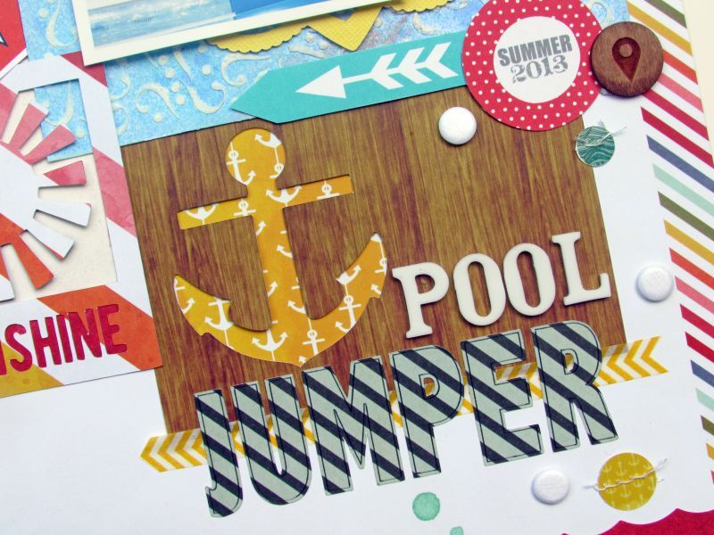
6. Use your die cut/embossing machine to cut the Blossom Doily Shape, to place in the center of the embossed design on the White cardstock.After I completed all of these steps, I placed the 6x6 square embossed design on my layout background paper and began layering all of my other products. I loved the way this design worked on my page, because the look of the Mini Curl Frame reminded me of splashes, that went along perfectly with the pool photo. And the Blossom Doily Die created a fun Sun element to place behind my photo. The Uncharted Waters and Color Me Happy collections from Glitz Design, were perfect for the Nautical feel of my layout and I also mixed in some of my own personal printables and some printables from Chic Tags.
Supplies: 6x6 Mini Curl Frame mask by Balzer Designs for The Crafters Workshop, Fantasia Collection: Blossom Doily Dies from Couture Creations, Radiant Rain Shimmer Mist from Creative Imaginations, Candi Dots-Chips, and Candi Fix by Craft Works Cards; Patterned Paper & Banner: Glitz Design; Cardstock: Bazzill; Printables: ashleyhortondesigns.com & Chic Tags; Thickers: American Crafts; Spray Mist: Studio Caico; Wood Veneers: Studio Calico & Freckled Fawn; Cut File: Juliana Michaels for The Paper Bakery; Washi Tape: Pebbles Inc.; Font: Abadi MT Condensed Extra Bold