Monday, June 29, 2015

Zoned Out: Creating Outside Your Comfort Zone | Upsizing or Downsizing

Today is the final day of my Zoned Out video series, and I have my last layout and video to share with you.  For this last layout, I downsized from a 12x12 layout to an 8.5x11 layout.  This was probably one of the hardest for me out of the series, because I am so programmed for 12x12.  I've done a few 8.5x11 layouts in the past, but I am never 100% happy with the end result.  I did like the completed design on this layout, but I still kept thinking at the end, should I add more, does it need anything else, what if I did this??  But that's what this series is all about...getting out of your comfort zone and trying new ideas!


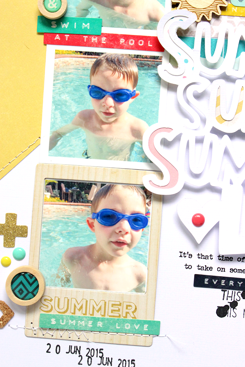
I decided to go with a photo strip look on this layout, to follow the rectangle shape of the 8.5x11 paper, compared to the square shape of the 12x12 size.  I kept the photos a little under 2 inches, so that left room for a larger title.  And I wanted to keep everything layered and close together, since I was working with the smaller background paper.

If you would like to check out my process for this layout, you can check out the latest Zoned Out video! 


Supplies:  Patterned Paper, Wood Buttons, Stickers, Frames, Bits & Wood Veneers:  Crate Paper; Die Cut:  The Cut Shoppe; Color Shine:  Heidi Swapp; Stamps:  October Afternoon & American Crafts; Tiny Attacher:  Tim Holtz; Die Cut Machine:  Silhouette Cameo

No comments:

Post a Comment